Understanding Fishers Linear Discriminant
Dimensionality reduction is a method of reducing the number of parameters in a given dataset. A reduction technique prioritizes those parameters which contribute the most towards differentiating between the classes of a given dataset.
The Curse of Dimensionality
The curse of dimensionality refers to all the problems that arise when working with data in the higher dimensions, which don’t necessarily carry to lower dimensions.
The primary concern is that the increased number of parameters contributes to substantial increase in computational costs.
As the number of parameters increase, how efficient a model is becomes more important. But increasing efficiency which might not be feasible. An ML Model trained with an increased number of parameters tends to grow very flexible and dependent on training dataset, called overfitting.
Techniques
Dimensionality reduction can be performed using several techniques. Broadly, these can be classified into supervised and unsupervised techniques. It is clear from the name that supervised dimensionality reduction techniques focus on aspects of labeled data, ensuring a complete separation of the data. There is a trade-off between reducing information loss and allowing for linear separation of data.
The methods for dimensionality reduction can also be divided into linear and non-linear techniques. Linear techniques work through applying linear transformations on the data.
Though they are computationally inexpensive, relatively speaking, they often miss more meaningful patterns in the data, which can be detected with non-linear or general purpose dimensionality reduction techniques. The techniques this report focuses on are:
Fisher’s Linear Discriminant
Linear Discriminant Analysis techniques find linear combinations of features to maximize separation between different classes in the data. Though it isn’t a classification technique in itself, a simple threshold is often enough to classify data reduced to a single dimension.
Though Fisher’s LD and LDA are interchangeably used, they differ in their assumptions about the data. FLD doesn’t require data to have:
- Normally distributed classes
- An equal covariance between classes
Nowadays, the term FLD is not used and Linear Discriminant Analysis is often used to refer to both FLD and multi-class Linear Discriminant Analysis.
For example, consider two classes in the dataset, with means μ1 and μ2 and covariances Σ1 and Σ2. $w$ represents the weights vector, which is perpendicular to the line of projection. FLD tries to maximize the ratio J, given by:
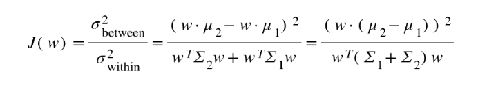
The following expression explains the relation between the weight vector, the vector joining the means of the two classes and the sum of their covariances.
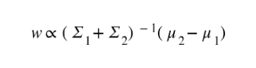
If the assumptions of normal data and the equal covariances of each class are satisfied, the same relations will represent LDA as well.
FLD Vs PCA
Both Linear Discriminant Analysis (LDA) and Principal Component Analysis (PCA) are linear transformation techniques that are commonly used for dimensionality reduction. PCA can be described as an “unsupervised” algorithm, since it “ignores” class labels and its goal is to find the directions (the so-called principal components) that maximize the variance in a dataset.
In contrast to PCA, LDA is supervised and computes the directions (linear discriminants) that will represent the axes that maximize the separation between multiple classes.
FLD is considered superior if you intend to use the modified data obtained for classification. This is because FLD chooses dimensions along which there is a reasonable degree of separability as opposed to PCA which blindly chooses dimensions without considering the data label.
FLD is considered the better algorithm with lower error rates, however there are studies which suggest that PCA outperforms FLD in smaller datasets.
Implementation
Lets use R. We’ll go with the ldfa library.
The ldfa library performs local Fisher Linear Discriminant Analysis and several of its variants, like semi-supervised FLD and kernel FLD.
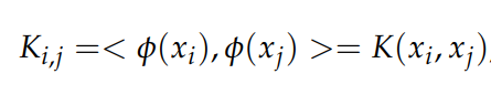
For our implementation, we’ll go with the kernel version of FLD since it generally provides better results due to the underlying non-linearity. The library uses the Gaussian kernel by default. Here, K represents the kernel matrix, and the element (i, j) is given by:
After the transformation, dimensionality reduction can be performed as normal.
The library uses S3 generic functions. S3 represents one of three object oriented systems in R. For more information, have a look at this page.
The object resulting from the reduction transformation has the following attributes:
- T: represents transformation matrix
- Z: new data resulting from the transformation
and methods:
- predict(): generate predictions on new data
- print(): print out summary statistics of the lfda object, including the trained transformation matrix and the original data after applying the transformation matrix
- plot(): generate 3D visualization with the help from rgl package
The initialize function assigns values based on the data. It separates the features (X) and the target (y) and assigns the number of dimensions into which the user wants to transform the data to dim.
initialize <- function(dat, dim_)
{
    rows <- nrow(dat)
    cols <- ncol(dat)
    X <<- kmatrixGauss(dat[, -cols])
    y <<- dat[, cols]
    dim <<- dim_
}
Coming to the fld method, the kflda method applies the transformation on our data. Our new transformed data is available in the Z attribute of model. After adding the target column back to the data, model__ is returned.
applyfld <- function()
{
    model <- klfda(X, y, dim, metric = "plain")
    model__ = data.frame(model$Z)
    model__$Species = y
    return(model__)
}
Lets run it on the iris dataset.
Importing the required libraries and the iris dataset.
library(lfda)
library(rgl)
library(e1071)
library(Metrics)

data(iris)
Defining some global variables
X <- NULL
y <- NULL
dim <- 3
dat <- NULL
Xtrain <- NULL
Xtest <- NULL
ytrain <- NULL
ytest <- NULL
Initializing a new device for creating 3D plots using rgl.
rgl_init <- function(new.device = FALSE, bg = "gray", width = 640)
{
  if( new.device | rgl.cur() == 0 )
  {
    rgl.open()
    par3d(windowRect = 50 + c( 0, 0, width, width ) )
    rgl.bg(color = bg)
  }

  rgl.clear(type = c("shapes", "bboxdeco"))
  rgl.viewpoint(theta = 15, phi = 20, zoom = 0.5)
}
A simple plotting functions to plot our data.
plotdata <- function(dat, cols, dim_)
{
    if (dim_ == 2)
        plot(dat, col=cols)
    else if (dim_ == 3)
    {
        rgl_init()
        rgl.spheres(dat[, 1], dat[, 2], dat[, 3], color = get_colors(dat[, ncol(dat)]), r=0.05)
        rgl_add_axes(dat[, 1], dat[, 2], dat[, 3], show.bbox = TRUE)
        aspect3d(1,1,1)
    }
}
A function to plot our svm’s hyperplanes on our data.
plotclassified <- function(model, data_)
{
    print(typeof(data_))
    print(model)


    if (dim == 2)
        plot(model, data_)

    else if (dim == 3)
    {
        # 3 plot methods to plot a specific pair of axes.

        plot(model, data_, X1~X2)
        # plot(model, data, X2~X3)
        # plot(model, data, X3~X1)
        par(mfrow = c(2, 2))
    }

    if (dim == 1)
        plot(model, data_, X1)
}
Normalizing our data before training to get more reliable results.
normalize <-function(x)
{
    if(max(x) != min(x))
        x = (x -min(x))/(max(x)-min(x))
    else
        x = x-x
    return(x)
}
A train-test split.
train_test_split <- function()
{
    select <- sample(1:nrow(dat), 0.9 * nrow(dat))
    Xtrain <<- X[select,]
    Xtest <<- X[-select,]

    ytrain <<- y[select]
    ytest <<- y[-select]
}
applyfld <- function()
{
    model <- klfda(X, y, dim, metric = "plain")
    print(head(model$Z))
    X <<- data.frame(model$Z)
    print(colnames(X))
}
This is the main driving method for creating 3-d charts using rgl.
rgl_add_axes <- function(x, y, z, axis.col = "grey",
                                xlab = "", ylab="", zlab="", show.plane = TRUE,
                                show.bbox = FALSE, bbox.col = c("#333377","black"))
{

    lim <- function(x){c(-max(abs(x)), max(abs(x))) * 1.1}
    # Add axes
    xlim <- lim(x); ylim <- lim(y); zlim <- lim(z)
    rgl.lines(xlim, c(0, 0), c(0, 0), color = axis.col)
    rgl.lines(c(0, 0), ylim, c(0, 0), color = axis.col)
    rgl.lines(c(0, 0), c(0, 0), zlim, color = axis.col)

     # Add a point at the end of each axes to specify the direction
     axes <- rbind(c(xlim[2], 0, 0), c(0, ylim[2], 0),
                                 c(0, 0, zlim[2]))
     rgl.points(axes, color = axis.col, size = 3)

    # Add axis labels
    rgl.texts(axes, text = c(xlab, ylab, zlab), color = axis.col,
                         adj = c(0.5, -0.8), size = 2)

    # Add plane
    if(show.plane)
        xlim <- xlim / 1.1
        zlim <- zlim / 1.1
        rgl.quads( x = rep(xlim, each = 2), y = c(0, 0, 0, 0),
                         z = c(zlim[1], zlim[2], zlim[2], zlim[1]))

    # Add bounding box decoration
    if(show.bbox)
    {
        rgl.bbox(color=c(bbox.col[1],bbox.col[2]), alpha = 0.5,
                    emission=bbox.col[1], specular=bbox.col[1], shininess=5,
                    xlen = 3, ylen = 3, zlen = 3)
    }
}
This method maps categorical values to colors, used for plotting datapoints belonging to multiple classes
get_colors <- function(groups, group.col = palette())
{
    groups <- as.factor(groups)
    ngrps <- length(levels(groups))
    if(ngrps > length(group.col))
        group.col <- rep(group.col, ngrps)
    color <- group.col[as.numeric(groups)]
    names(color) <- as.vector(groups)
    return(color)
}
Simply adding the diagonal elements of the confusion matrix x and dividing the reslt with the total sum to get the accuracy.
accuracy <- function(x)
{
    return (sum(diag(x)/(sum(rowSums(x)))) * 100)
}
The driver function
main <- function()
{
    # initializing all global parameters
    initialize(iris, 3)

    # applying dimensionality reduction on our data
    applyfld()

    # applying train-test split
    train_test_split()

    traindata <- data.frame(cbind(Xtrain, ytrain))

    # training our svm
    model_ <- svm(ytrain ~ ., data=traindata, type="C-classification")

    # plot the classified dataset -- the svm's decision boundaries
    plotclassified(model_, traindata)
    pr <- predict(model_, Xtest)

    tab <- table(pr,ytest)

    # print the resulting accuracy
    print(accuracy(tab))
}
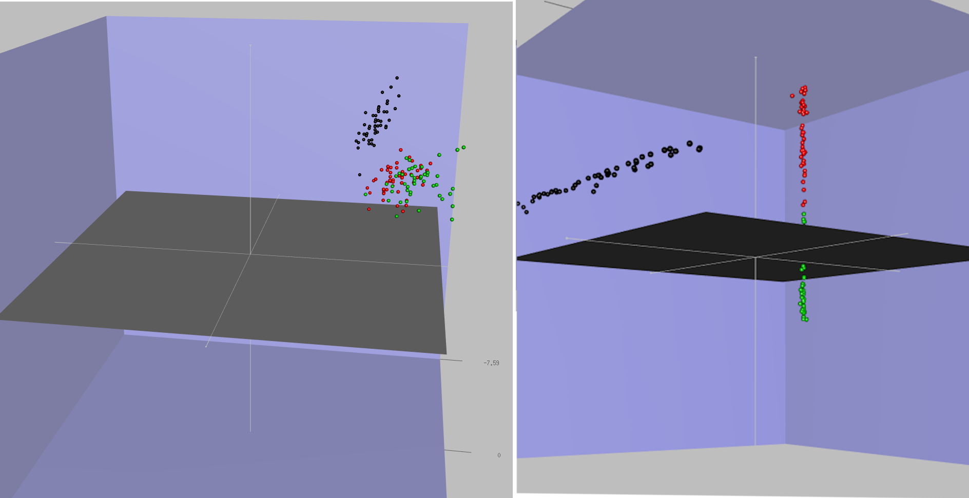
Results
We get the following plots after classifying our data with the svm. Since the classification happens in 3d, we generated three 2d plots.
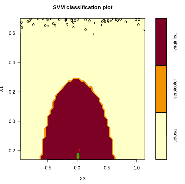
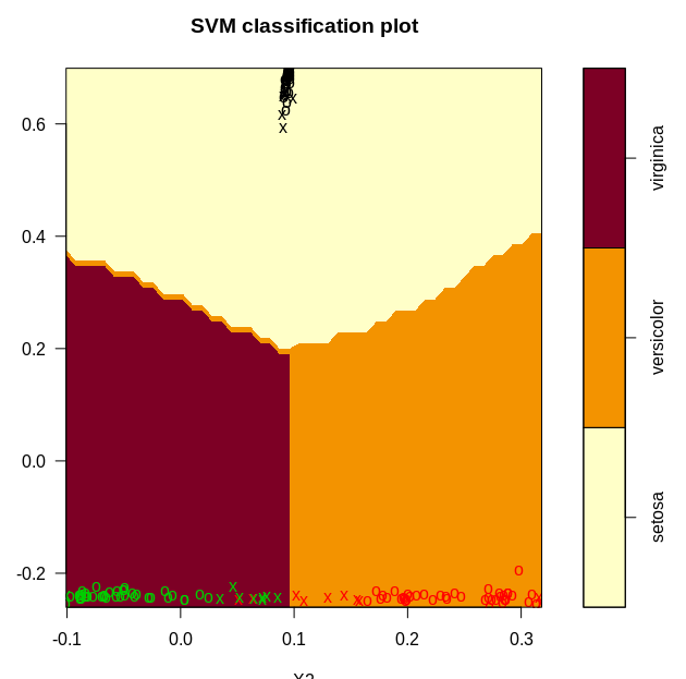
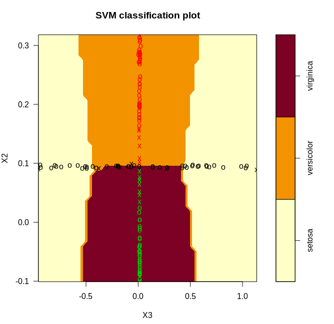
From the plots, it is clear that we have a near perfect accuracy on the iris dataset.